Work / Case study

WEC — World Endurance Championship

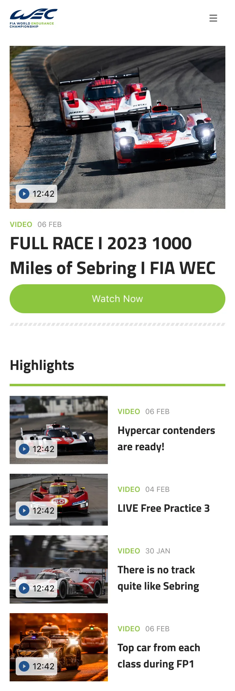
A UX/UI redesign for the FIA World Endurance Championship — an engaging, intuitive, content-rich experience for motorsport fans across live coverage, news, results, and teams.

ProjectFIA World Endurance Championship
RoleUX Researcher, UI/UX Designer
ToolsFigma
WEC across devices

🎯 The Challenge

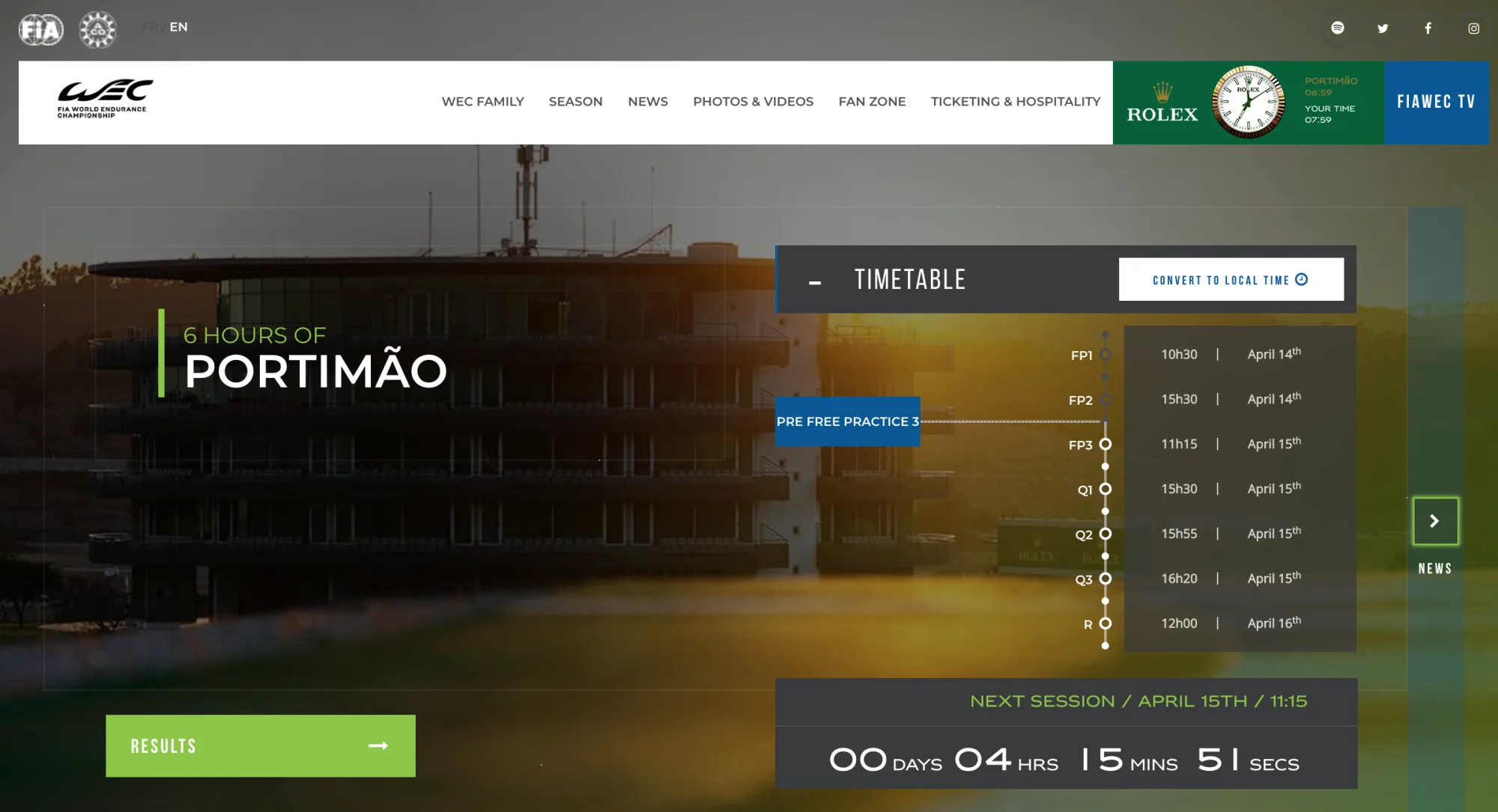
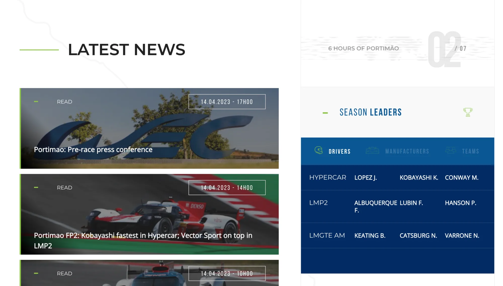
The FIA World Endurance Championship (WEC) is a high-performance motorsport series showcasing cutting-edge technology and elite competition. However, its digital presence didn't reflect the energy, pace, or clarity fans expect from a world-class sport.

My goal was to create a more engaging, intuitive, and content-rich experience for motorsport fans — one that supports live coverage, news, race results, and team info without overwhelming or confusing the user.

🔍 My Approach

  • Heuristic Evaluation — identified usability and content-hierarchy issues on the existing site, including poor navigation flow, inconsistent visual hierarchy, and a lack of mobile optimisation.
  • Comparative Research — studied how leading platforms (Formula 1, MotoGP, The Athletic) present schedules, articles, race data, and team info to define best-in-class standards.
  • User Needs Assessment — focused on core tasks: checking races and results, browsing news and technical updates, following teams and drivers, and engaging with media.
  • Wireframes & UX Flow — a modular layout with sticky nav and smart filters, card-based architecture for editorial flexibility, and a clean mobile-first design.
  • UI Design — bold and modern, inspired by the technical precision of endurance racing: clean typography, dark themes, high contrast, and iconography drawn from pit boards and telemetry.

🔎 Heuristic Evaluation

The existing WEC website struggled with several usability issues:

  • Cluttered interface — overuse of visual elements and lack of spacing created cognitive overload.
  • Poor contrast & readability — low contrast ratios and overlapping text made content hard to scan, especially on mobile.
  • Navigation friction — core information like race calendars, news, and classifications was not easily accessible or clearly prioritised.

These issues impacted both new and returning users, especially during high-traffic periods like race weekends. A clearer visual hierarchy, improved contrast, and a more structured layout would greatly improve overall experience and accessibility.

⚙️ Key Features

  • 🗓️ Event Hub Pages — everything about a race weekend in one place
  • 📰 News & Features — clear hierarchy and filtering for articles and updates
  • 📊 Results & Standings — easy to digest across devices
  • 🏎️ Teams & Drivers — brand-rich team profiles with key data
  • 📱 Mobile Optimised — designed mobile-first for fans on the go

💡 Outcome

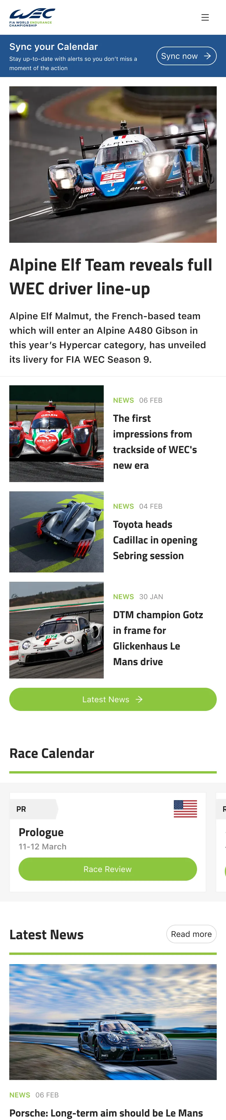
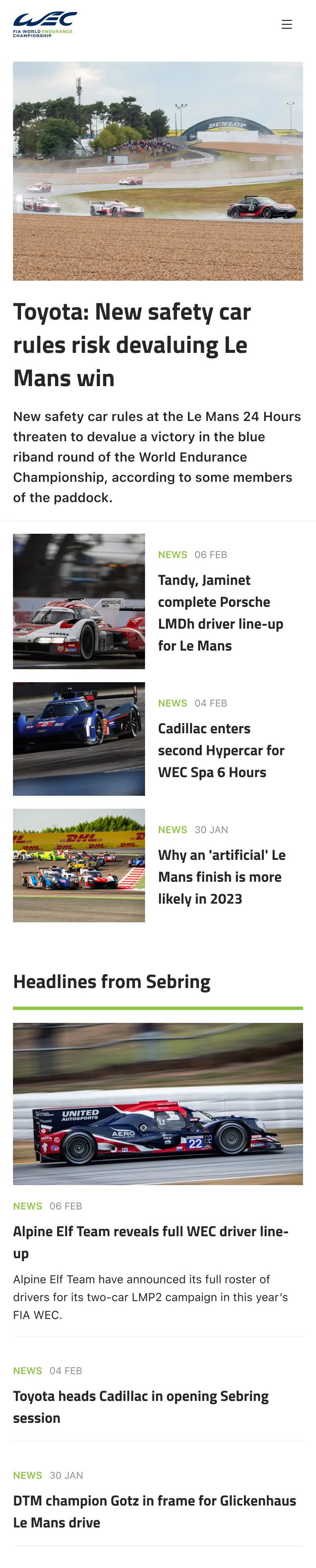
This project let me apply my passion for motorsport to a full UX/UI redesign. It honed my skills in content hierarchy, responsive systems, and editorial design — while also allowing me to reimagine how elite racing can be communicated visually and functionally to a global fanbase.

WEC final homepage

Like what you see?

If you need design support — or think I'd be a great fit for a role — I'd love to hear from you.

Get in touch